Increased automation and limited targeting will bring about a shift in the way we see our role as advertisers and how we plan our campaigns in 2024. Not only will we play a more strategic part rather than an executional one, but we will also have to rely less on targeting in the process.
Gone are the days when you spent hours refining your audience targeting to perfection. Now is the time to embrace broad targeting and face the cookieless future heads-on. How do you do that? Go back to basics and put the creative at the center of all that you do.
Get actionable PPC tips, strategies, and tactics from industry experts twice a month.
This change in mindset and priorities will influence your work on various levels, from PPC strategy and planning to data analysis and testing.
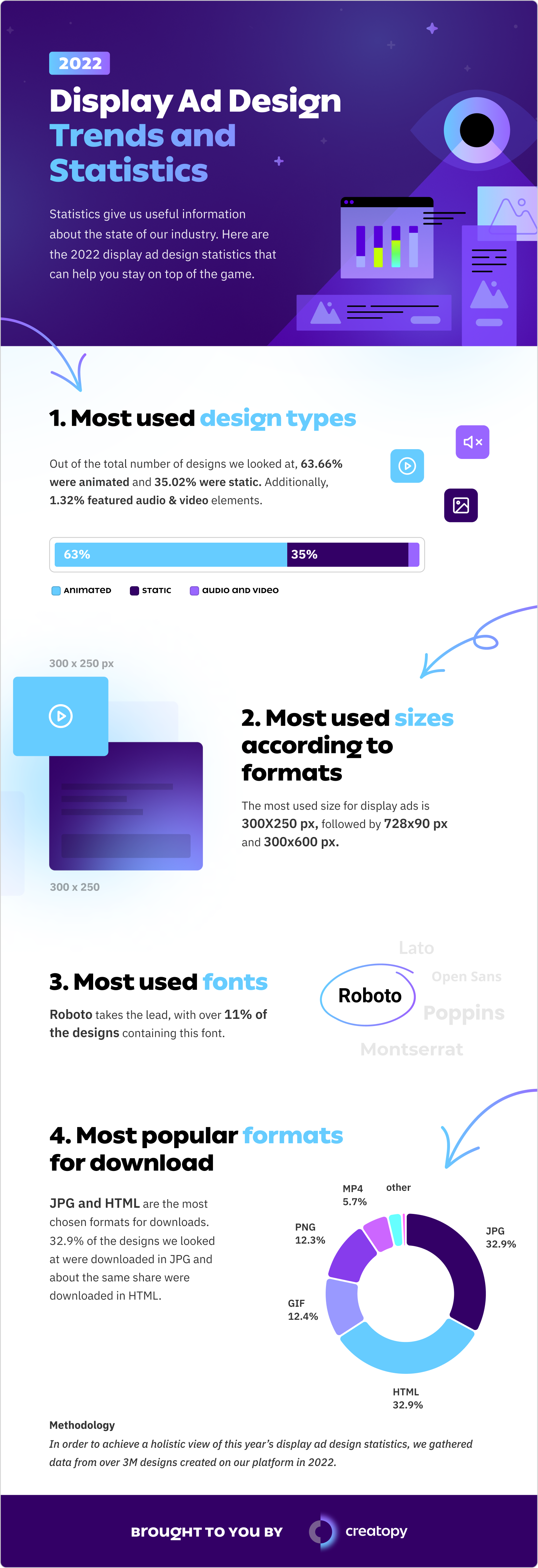
A creative-first approach means paying more attention to how an ad looks and performs and collecting data that will inform your future decisions. For example, the statistics may tell you which display ad design types are the most popular.
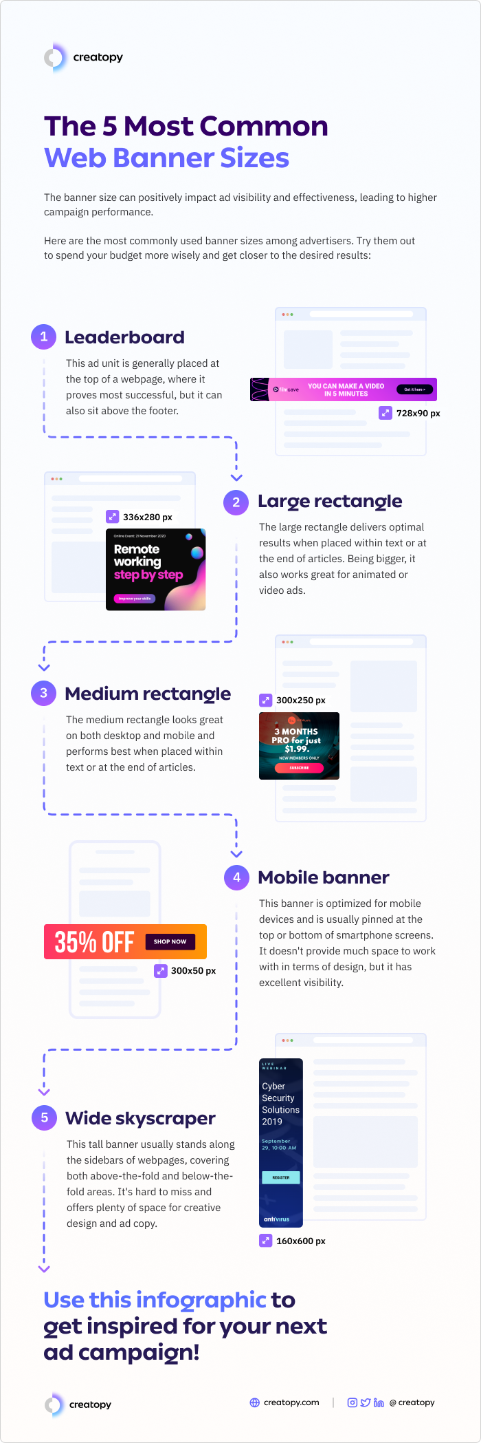
Or which standard banner sizes would help you achieve your campaign goals.
To illustrate different approaches to making your creative stand out, I would like to offer an example from my own professional experience and see what we can learn from it.
Context
Me and my colleagues at Creatopy organize webinars periodically, in which we invite industry experts to share their valuable insights on current and complex advertising topics. This is not only to help our participants deepen their understanding of said subjects but also to show them actionable tips that they can apply to their ad campaigns.
It is part of my job to promote the webinars and make sure they reach the right audience and bring as many registrations as possible. The campaign that I want to talk about is the one I ran for the webinar on How to create zero-click ads that convert with Jonathan Bland, its landing page is shown below.
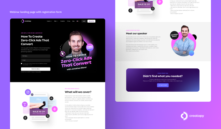
Source: Creatopy
Ad creatives
For this particular campaign, I decided to take a more out-of-the-box approach based on recent trends and test designs that look decidedly different from the ads we usually run alongside some of our more tried-and-true types of creatives.
So I used seven ad creatives in total, three of which were more conventional, and the other four less conventional.
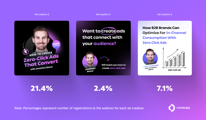
Source: Creatopy
As you can see in the image above, what I mean by ‘conventional’ is the fact that all three ads represent the classic way of promoting a webinar. They convey the ‘what’ and ‘who’, as in the topic of the webinar, and the name of the speaker, whose face is also featured in the visuals. The phrase ‘free webinar’ also appears on all three ad designs.
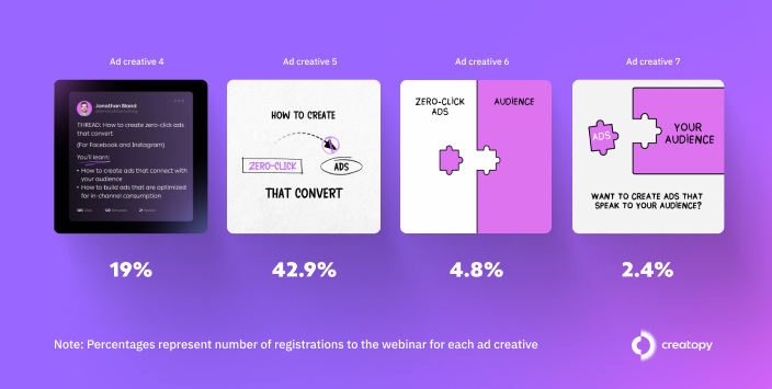
The second set of ads is unconventional in the sense that they don’t make it clear from the start that you are seeing an ad that promotes a webinar.
Source: Creatopy
First of all, none of them contains the word ‘webinar’. And secondly, the face of the speaker is shown only in one of the visuals, the first ad design seen in the image above. The ad looks like a Twitter thread, so the speaker’s face appears just as part of his Twitter profile and does not present him in direct correlation with the webinar as seen in the conventional ad designs set.
It’s clear that these four ad designs don’t make any reference to the main elements that the first three do—the words ‘free webinar’, the face and name of the speaker—which are key details to mention, you would think, if you want people to register for your webinar through an ad.
Campaign stats and results
All seven ads ran on Instagram, and the data presented here is for the first 19 days of running the webinar, from December 14, 2022, to January 2, 2023. We spent $1,032.52 during this period of time and managed to bring 42 registrations to the webinar, at a cost/registration of $24.58.
All the ad creatives targeted the same:
- Nine locations: Australia, Canada, Germany, Denmark, Finland, the U.K., the Netherlands, Norway, New Zealand, Sweden, and the U.S.
- Age group: 25-55 years
- Audience: advertisers, based on a mix of interests, behaviors, and job titles
- Language: English
- Device: Mobile
- Landing page
- Description: “Find out in our webinar how to optimize your ad for the 99% of people who are not clicking on your ad.“
- CTA button: “Learn more“
The only variable here was the creative.
This is the first webinar where we also tested ads that don’t necessarily look like ads, the aforementioned second set of creatives. We wanted to increase interest through the creative. To see the impact the creative has over the results, if any. And the results were interesting, to say the least.
The more conventional type of ads brought 30.9% out of the total registrations to the webinar, while the unconventional ones brought the rest of 69.1%. What’s more, the ad design with the highest percentage of registrations by far, namely 42.9%, is part of the unconventional set. It amassed double the percentage of registrations compared to the creative that came in second place, an ad from the conventional set (21.4%). Close on their heels is another unconventional ad, with 19% of registrations.
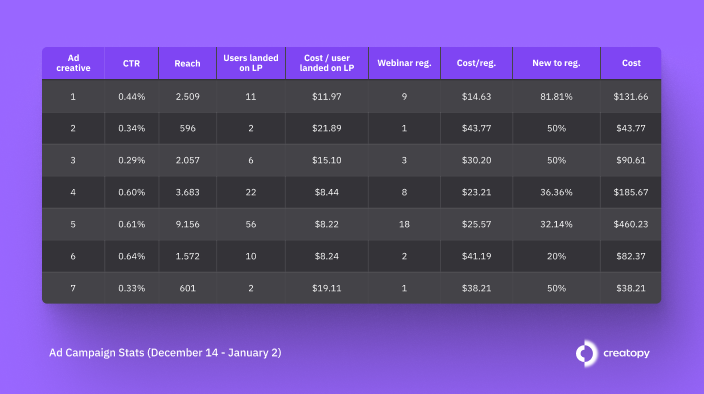
In the table below you can see more in-depth data about each ad creative, such as CTRs, reach, number of users who landed on the page, cost/landing page view, number of registrations to the webinar, cost/registration, registration rate (registrations divided by users, multiplied by 100), and cost.
Source: Creatopy
This data can provide us with a better understanding of the true winners of this experiment.
The ads that the algorithm pushed in front of the users and which spent more budget in total are indeed in our top three in terms of webinar registrations, while also having the lowest costs/registration.
CTR-wise, the top three are entirely made up of unconventional ads, the sixth creative occupying the first place with a CTR of 0.64%, followed very closely by the fifth and fourth ads, with CTRs of 0.61% and 0.60%, respectively. Coming in fourth is Ad Creative 1, part of team Conventional, with a CTR of 0.44%. We notice a higher click-through rate on the more out-of-the-box ads, showing us that they are more appealing to the users and more powerful in arousing their interest and curiosity.
Also, interestingly enough, if we look beyond the number of users brought to the webinar, things look a little bit different. By registration rate standards, which are obtained by dividing the number of registrations by the number of users who landed on the page, the winner is the first ad, which is more conventional. This ad also takes the prize when it comes to cost/registration, which is the lowest out of all seven ads.
Why did this happen? Simply put, the first ad creative is the most similar to the landing page from a visual standpoint. All ad creatives are designed with the landing page in mind, but it would have been difficult to test these seven different ad designs and have them all incorporated into the same landing page.
So what are the learnings?
The results show us that the tried-and-tested way of doing things can still bring good results. But to win in advertising, we must venture on the experimental path as well.
1. A continuous testing mentality
I wouldn’t advise giving up your usual way of doing things altogether, since we saw that the more conventional type of ads still moves the needle. But in order to bring the best results for your clients, you have to take both methods into account. You must be willing to test more often and test different approaches, even those that you initially thought wouldn’t stand a chance.
You will be surprised to find that, oftentimes, what we think will fail is what the audience ends up connecting with, which is more important when all is said and done. And it is this habit of continuously testing—even when things are going well—that will bring you the most rewards in the long run.
2. A personalized approach to ad creatives
I highly believe that in 2024 the ad creative will be the “new targeting”. For a campaign to achieve success this year, ad creatives will have to be more relevant to the audience than ever. In our case, the audience for the webinar is made up of advertisers, as I previously stated. This audience is primarily interested in how to create ads that convert since this is the way advertisers measure and present the success of their work to their clients.
On this note, we can see that all the top three ad creatives (1, 4, and 5) in terms of users brought to the webinar and cost/registration talk about ads that convert. Only these three ads contain the word ‘convert’, which I think is no coincidence at all. The message is both catchy and tailored to the needs of the target audience.
3. Beyond the creative is the landing page
Another learning we must take with us in 2024 is that landing pages and ad creatives must match as much as possible. The ad creative does the first part of the job, that of attracting the target audience, but the landing page is the one that can either make or break the deal. Without the ad creative, a perfect landing page wouldn’t amount to much by itself, but together they are a very powerful duo.
They must go hand in hand so the users can experience a steady flow from the ad creative to the landing page since they unconsciously expect to find the same elements on both of them. Otherwise, the chances are high that the flow is disrupted, and the user gets confused, and is driven away from our page.
To prove my point, the first phrase on our landing page mentions creating ads that convert, which happens to be present in all three of our best-performing ads as well.
Whether conventional or not, the ads that took the top three places used a message that was of high relevance and interest to the target audience, and at the same time strongly connected with the message found on the landing page. Moreover, the ad creative with the lowest cost/registration is the one that reflects the landing page the most, offering a seamless experience for the users clicking on it.
Over to you
To wrap things up, I hope I have provided some food for thought on how to better incorporate and prioritize the ad creative in your PPC strategy this year. Now all that’s left to do is to put them to the test and see what works best for your particular campaign needs. And don’t forget to keep on experimenting.
Get actionable PPC tips, strategies, and tactics from industry experts to your inbox once a month.


