Both Google and Optmyzr launched updates to their MCC dashboards for AdWords today offering exciting new functionality. Here’s what’s new.
AdWords MCC changes
Here are the new capabilities launched in the AdWords MCC update:
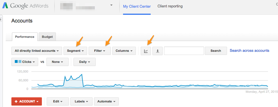
- Segment MCC data
- Filter MCC data
- Graph MCC data
- See data further back than 90 days
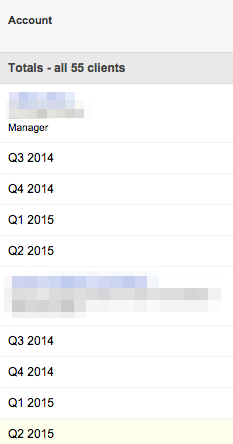
Now you can segment the data the same way you already could in individual accounts, for example by day of week, network, device, click type, location on page (top or other), and conversion name. Here’s what that looks like when you segment the data by quarters:
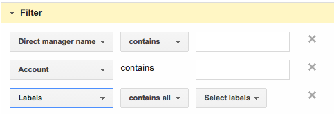
You can also filter the data, for example to see just the accounts managed by a particular account manager or for a particular vertical. There are the same filters for metrics and conversion data we already know from individual AdWords accounts but here are the new filters associated with the MCC level:
You can now view any two metrics on a chart. This is cool because it works together with the filters so it’s easy to get a chart for accounts that meet particular criteria, like who is managing them.
The most subtle but possibly most important change is that you can now look at data further back than 90 days.
Optmyzr MCC changes
At Optmyzr, here’s what we updated today along with a few other recent changes to our MCC that you may have missed:
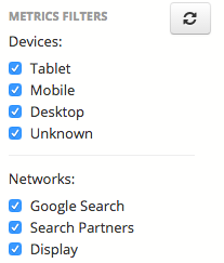
- Filter data by network and device
- Include Google Analytics data
- Include account Quality Score data
- Redesigned account picker
- Birds eye view improvements
- Enhanced account Cues
- Faster access to the Optimizations Inbox
Before today’s updates we already offered a date range picker that can use any date range, date range comparisons, and the ability to filter data for different segments and networks. Here’s what our filters look like:
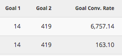
By linking your GA accounts to Optmyzr (a capability in our Pro plan), you can add goals, goal conversion rate, and e-commerce directly to the MCC dashboard where you can even use date range comparisons to get a quick view into how your results are changing.
We also offer a column that shows the account Quality Score, a metric we calculate from the keyword level QS numbers Google shows in their UI. It’s useful to track this number in the MCC dashboard to find out if all the optimization work you do is paying off in terms of improving relevancy.
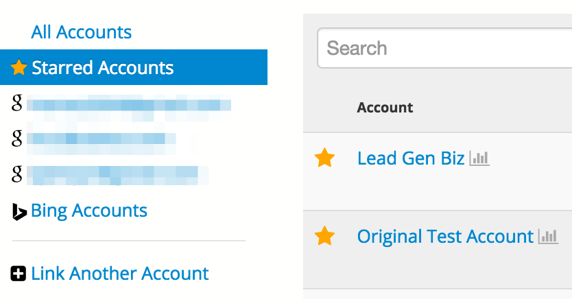
Here’s the new account picker we launched. When you star accounts, you can see just those accounts in a separate view. Because every user gets to star their own accounts, this is particularly useful for teams where every person may be working on different accounts and wants to track those accounts most closely.
Our birds eye view has a new icon to make it easier to find. This view can be very useful when you quickly need to see if a change in performance is due to a one-day anomaly or part of a longer trend.
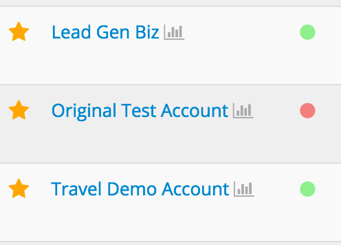
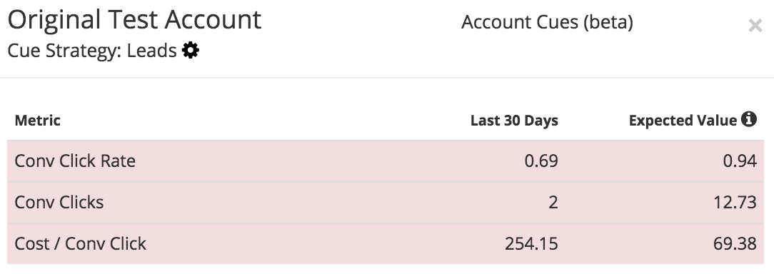
Our account Cues feature is still in whitelist beta (contact us for access) and it lets you compare each account’s recent performance against historical expectations for a set of typical KPIs that depend on the business model of each account. The cues look like red or green dots next to each account.
Here is the detail view you get when you click on the Cue:
Finally we’ve given our Optimizations Inbox a new home on the MCC dashboard. If you haven’t tried it yet, it’s a great place to find out which optimizations have the most changes available for all your accounts.


