Figuring out whether an AdWords account is healthy or not can be a very time-consuming task, especially when managing multiple accounts. In the past, we added red and green arrows to show the directionality of key metrics to our MCC dashboard.

However, we found that this still didn’t help us quickly identify accounts that were in trouble because accounts with lots of green arrows could still be underperforming. So one of our engineers, Manu, got to work on figuring out how to roll up all the data into a single indicator of account health. Today we’re starting a whitelist preview of what we came up with: Account Cues.
Each account gets a color coded dot that indicates how the account is performing for its key metrics when comparing a recent period to the last 6 months of data:
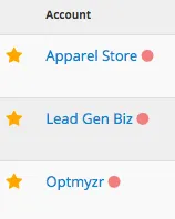
By clicking on the dot, you can see more data about the metrics that Cues is evaluating:
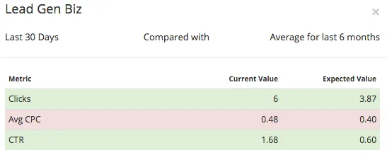
There are five types of cues available for every account and they are based on the main goal which can be sales (conversions), leads (converted clicks), traffic (clicks), branding (impressions), or meeting a target for one metric of your choice.
For a goal like leads, we automatically analyze three related metrics: converted clicks, converted click rate, and cost per converted click. If any of these deviate more than 10% from the expected values based on six months of historical data, the account will be flagged with a red dot to draw attention to it.
Once you see that an account is not performing well, the next step is to investigate why. This can also be quite time-consuming so we tried to simplify this too with a new Data Insight called “Ask Optmyzr”. When you start with this tool you can ask a question about why key metric is either up or down for a certain date range:

Then we pull several reports in the background and present the results in an easy-to-read manner like with a cause tree:
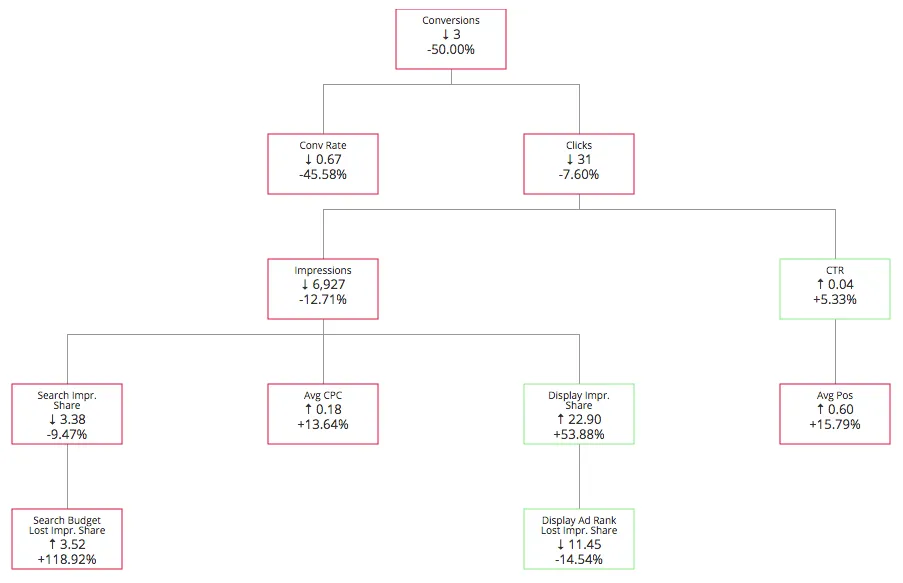
The concept of this tool is that every metric depends on other underlying metrics and rather than randomly hunting in your account for things that are different we show potential causality. For example, if clicks are down like in the example above, we highlight that fact in red and show the underlying related metrics: impressions and CTR. In this case, CTR is not an issue (it’s green), so we look further down the tree to see that impressions are down because IS lost due to budget has increased dramatically. From this visualization, we can quickly determine that raising the budget and taking a look at the conversion rate of the landing pages should help restore conversions to this account.
We provide additional aggregated reporting for campaigns, ad groups, keywords, and queries to help you find the specific elements with the biggest change in the account. Finally, we combine all this data with segments like devices and networks to help you discover if any of these are contributing to the problem.
We’re excited to launch Account Health Cues and Ask Optmyzr in whitelist beta today and we can’t wait to hear your feedback about how we can improve this to make your lives easier when managing PPC accounts. If you want to try it out, just drop us a line through the support links.


