For a business, Google Shopping ads are a new channel to reach customers. Half of the top retail advertisers are already using it.
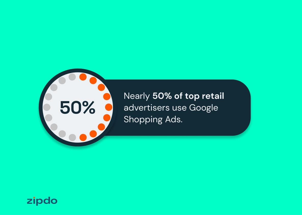
50% of top retail advertisers use Google Shopping ads
But not every Google Shopping campaign will get people bombarding the ‘‘Add to cart’’ button. It might help to look at a Google Shopping ads example for inspiration.
Lucky for you, we discuss three examples below.
What Makes a Google Shopping Ads Example Worth Following?
Every Google ads campaign has two notable phases.
- Pre-Click Phase: It encompasses everything people see before they click on your ad.
- Post-Click Phase: It’s the landing page experience for the audience after clicking on your ad.
A common mistake many marketers make is that they focus solely on the pre-click phase. Their ads look stellar with great copy and graphics.
However, when the audience clicks on the ad, they are directed to a terrible landing page.
And that’s when it all falls apart.
A model-worthy Google Shopping campaign should have both phases working together like a well-oiled machine. It should also have the following components:
- 1:1 Conversation Ratio: Simply put, each landing page should only have one call-to-action.
- Personalization: The landing page should be tailored to the ad copy and keywords used in the pre-click phase.
- Persuasive Copy: The copy should be benefit-oriented.
By persuasive copy, we mean that the language should be compelling enough for a customer to take action.
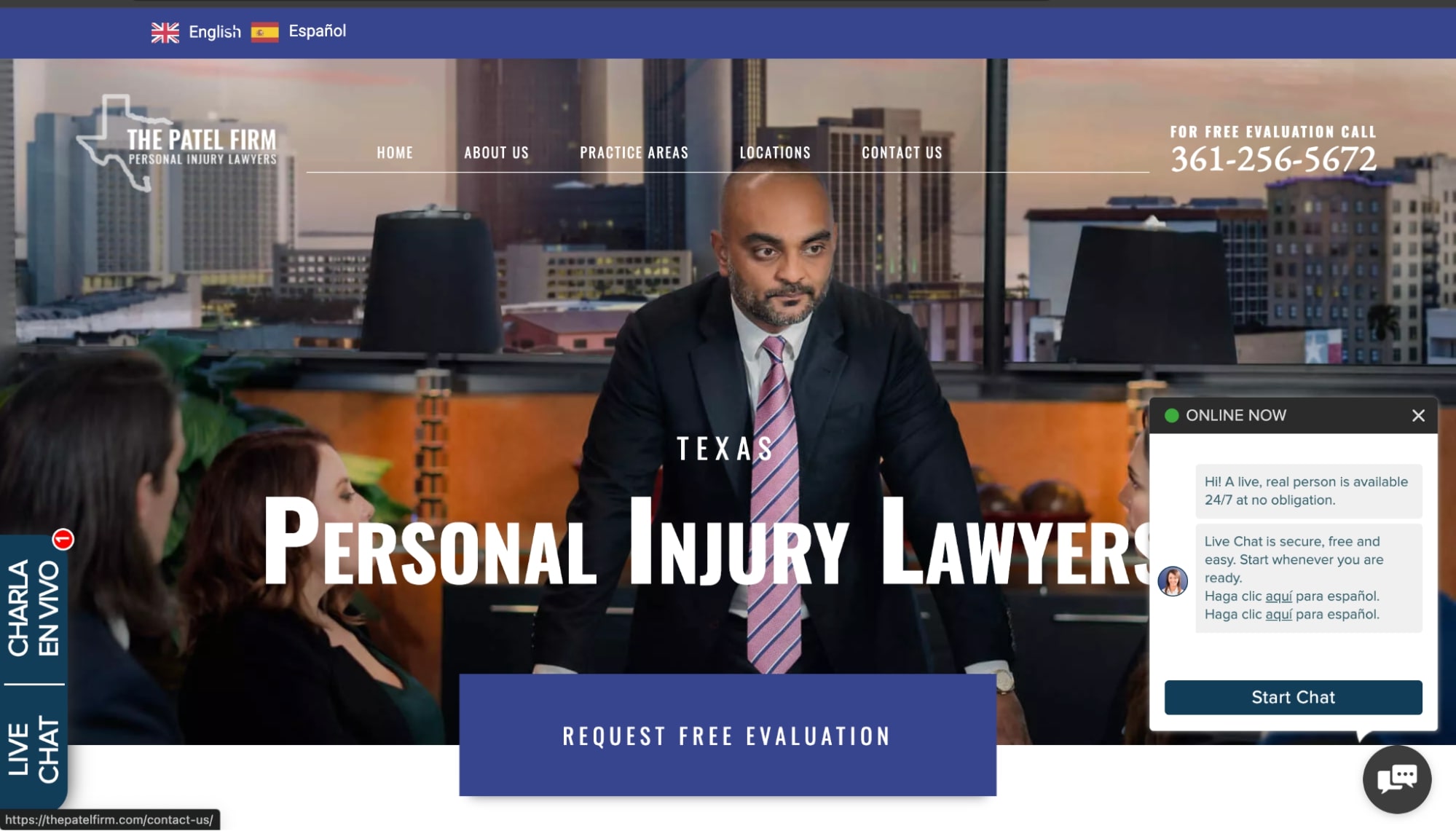
For instance, a lawyer could use a persuasive CTA on their landing page. Instead of saying, “Sign with us!” say, “Click Here for a Free Case Evaluation!”
This creates a sense of urgency and highlights the benefits the customer can get.
This is what the Patel Firm does on their homepage:
Keeping these components in mind, we’ve selected three Google Shopping campaigns you can learn from.
3 Google Shopping Ads Campaigns for Inspiration
For any Google Shopping campaign, there are three main steps:
- Product feed optimization
- Winning bidding strategy
- Proper campaign structuring
Let’s see how the following companies have perfected these steps.
1. DW Candles
DW Candles is a scented candle brand that also makes home fragrances. The company has a wide range of candle options, such as pillars, votives, jars, etc.
The thing about the candle market is that it’s pretty saturated. Big brands like Yankee Candle and Bath & Body Works dominate the market.
DW Candles uses Google Shopping ads to increase its reach and attract new customers.
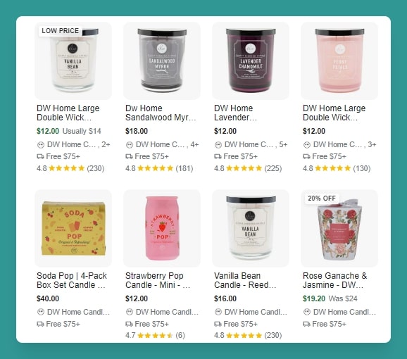
DW Candles Google Shopping ads
In the pre-click phase, you can see that the brand has an assorted collection of candles on their Google Shopping ad. Here are some noteworthy things about these ads:
- Versatile Options: The first thing you notice as you look at these ads is that they don’t show the same product category. Yes, they’re all candles, but they’re different types of candles. The wide selection makes the ad relevant to a larger audience.
- Keywords: The brand uses keywords that indicate the fragrance of the candle. In most cases, that’s the first thing people want to know about a fragrant product.
- Pricing: The prices are right there. Also, the products on discount have ‘‘20% off’’ or ‘’low price’’ tags on them to grab attention. Viewers can also see they get free delivery after purchasing $75 worth of candles. That’s an incentive to shop more.
- Ratings: The presence of social proof (even better, a good one) makes these ads even better. Not only can the audience see the rating, but they can also see how many people have rated the product. The thought process goes something like this: if 225 people have rated a candle 4.8, it must be good, no?
- Pictures: At first glance, you only see one picture per product. But as you hover over the product, you see a slider to see product media. The other pictures show different sizes of variations of the candles.
Note that potential customers can see all of this without even clicking on anything. That’s brilliant!
You want to give your customers enough information to make up half their decision right at the pre-click phase.
Now, let’s look at the post-click phase of this Shopping Campaign. You click on a candle — let’s say the Tierra Santal — and go to the landing page.
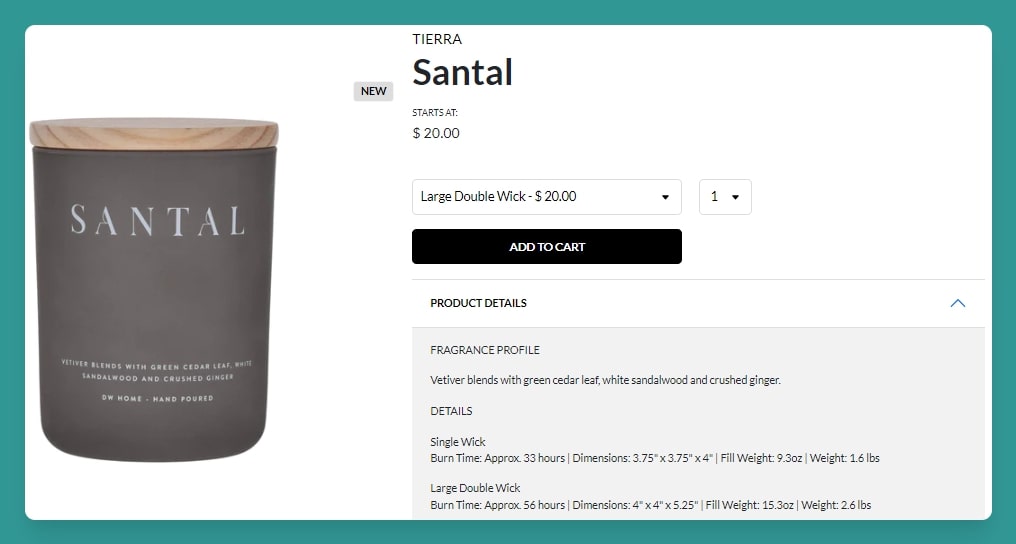
DW Candles landing page
First impression: it’s sleek and easy to navigate. There’s only one CTA — Add to Cart.
We also see the fragrance details. The copy is concise and crisp. Also, the important details, such as burn time and weight, are also right there.
Takeaways
Here are some takeaways from this campaign:
- Provide as much information to the customer as possible on the Google Search page.
- Add professional images of your product.
- Include keywords in the description.
2. Paper Culture
Paper Culture is an eco-friendly stationery company that produces 100% recycled products.
In talks with Google, the CEO of Paper Culture, Chris Wu, said that a challenge they face as a small business is that they don’t have the ‘‘brand of our larger competitors.’’
Google Shopping Ads helped the company bridge this gap. Paper Culture used this campaign in addition to the search ads strategy.
Let’s look at why this campaign helped the company increase its return on investment by 3x compared to any other channel.
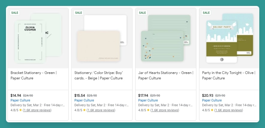 Like DW Candles, Paper Culture also shows high-quality images of the company’s products. Again, we see generous use of keywords. For example, keywords like ‘’Paper Culture,’’ ‘’stationery,’’ and ‘’cards,’’ ensure a higher chance of these ads popping up when someone searches for these products.
Since the products are on promotion, there’s a Sale tag on the ad. The prices (new and old) are clearly evident. One thing that you’d notice is consistent is the social proof.
Paper Culture also displays the product rating along with the number of reviews. Again, most people are likely to believe that a product with 1.6k positive reviews MUST be good.
One way Paper Culture takes the Google Shopping campaign a step further is by showing the estimated delivery time. That’s a good touch. Here’s why.
The products Paper Culture makes (cards, etc.) often have a lot of emotional value attached to them, especially when purchasing for occasions like birthdays or anniversaries. Also, these are event-specific products and not everyday-use items like candles or shoes.
So, the customer has no use for them if the product doesn’t arrive on time. Therefore, displaying the estimated delivery time helps build trust and reassures customers that they will receive their products in time for their special occasions.
Onto the post-click phase!
As soon as you click on a product and come to the landing page, you see an offer: 50% off on your first purchase if you sign up for emails.
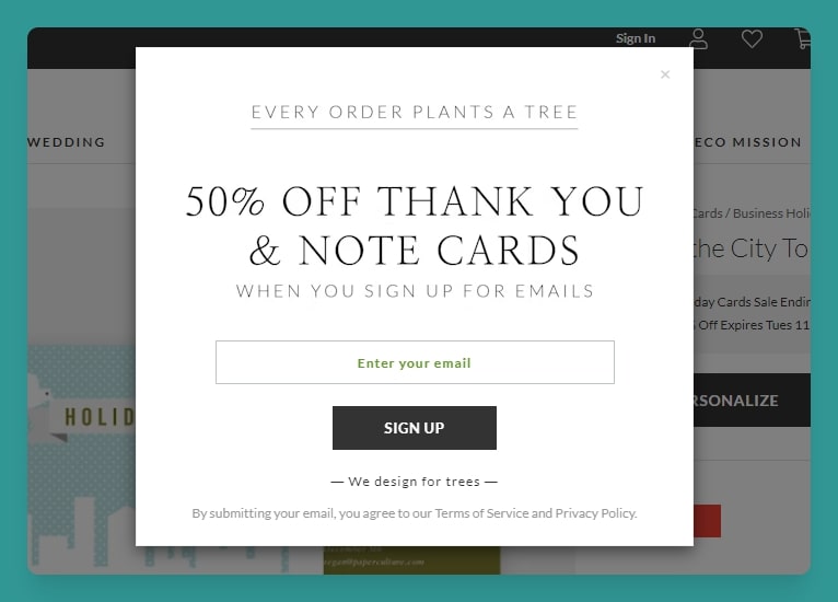
Paper Culture landing page
Moving forward, again, you see a single CTA: Personalize. The landing page is super easy to navigate. Everything from the product images to the customization options is right there without the need to scroll even once.
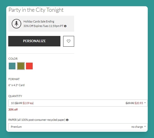
Paper Culture product page
If you have a similar business model where customers can personalize items, we recommend having a live chat widget on the landing page. It will resolve customers’ personalization-related queries in real-time.
Takeaways
The takeaways from this campaign are:
- Show product-specific information in your ads.
- Ensure variety in product selection for ads to capture a wider audience.
- Keep the landing pages simple and easy to use.
3. Buttercloth
Buttercloth is a mid-range clothing brand known for its soft and high-quality men’s shirts.
They worked with an agency called MuteSix, which was responsible for creating the brand’s Google Shopping campaign. One of their primary goals was to reduce budget wastage through efficient campaign segmentation.
Campaign segmentation helped the brand optimize its budget allocation and pitch top-selling products. As a result, Buttercloth saw an 8% increase in return on ad spend and a 1.25% click-through rate, which was higher than the 0.8% they got from their Main Shopping campaign.
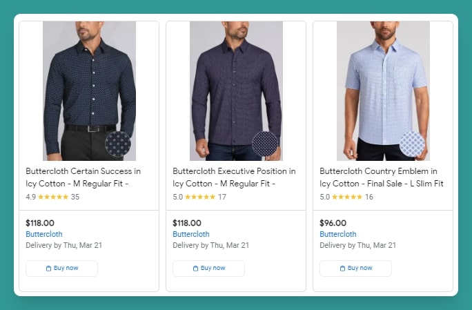
Buttercloth’s Google Shopping campaign goes beyond what you see above. For instance, the company knows social proof matters.
What did they do to get it?
They started a tiered rewards system. Customers get points to share their reviews. If they add pictures and videos, the rewards are even higher.
The system really helped the brand get reviews to show on the Google Shopping ads.
Also, the product titles are keyword-rich and give the viewer enough information about the product. Let’s take ‘’Buttercloth Executive Position in Icy Cotton - M Regular Fit.’’
Without even clicking on the link, we know this product will be high-quality (cue the name). It has a regular fit, and it’s in an icy blue color.
The price, rating, number of reviews, and estimated delivery time are all mentioned in the ad.
One thing Buttercloth does differently from Paper Culture or DW Candles is that they display the ‘’Buy Now’’ button on the ad. That’s one less step for the customer to reach the checkout page.
For products that are on sale, the ad shows ‘’$x below typical’’ to let the customer know how much money they’re saving. It just saves a lot of mental gymnastics for the customer.
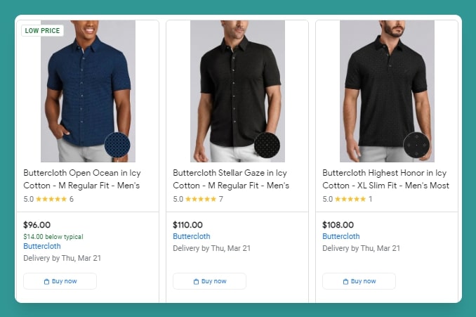
As for the post-click performance, all you have to do is click the ‘’Buy Now’’ button, and you’ll come to the checkout page.
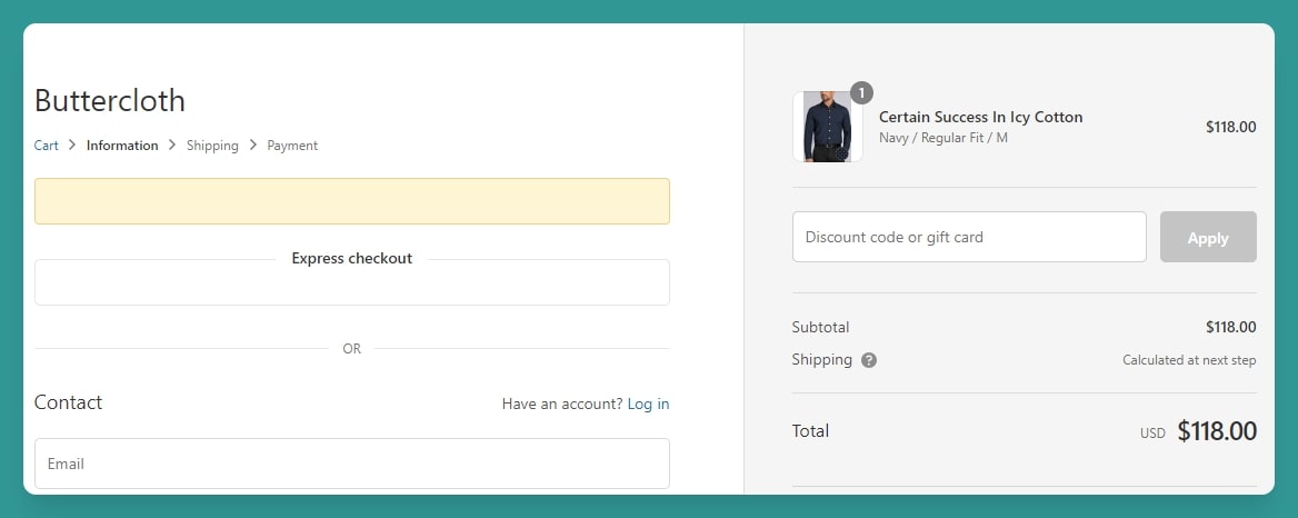
As evident, Buttercloth really makes Google Shopping what it’s supposed to be: Google Shopping. You don’t even go to their product page. You basically shop on Google and pay on the company’s website.
Takeaways
These are the takeaways from Buttercloth’s campaign:
- Make the purchase process short and sweet for customers.
- Provide enough information in the ad copy to save the customers a trip to the product page.
- Incentivize your customers to leave reviews.
Wrapping it Up
By drawing inspiration from some great Google Shopping ad campaigns, you can run better ads for your business. If you liked this article and want to learn how to optimize your shopping campaigns for better performance, read this article.
And if you’re in need of a solution to run better shopping campaigns, give Optmyzr a try. Our tools provide you with great automation capabilities giving you the control.
You can sign up for a 14-day free trial here.
Thousands of advertisers — from small agencies to big brands — worldwide use Optmyzr to manage over $5 billion in ad spend every year. Plus, if you want to know how Optmyzr’s various features help you in detail, talk to one of our experts today for a consultation call.
You will also get the resources you need to get started and more. Our team will also be on hand to answer questions and provide any support we can.


